KAI Brand Refresh
| Sector | Category |
|---|---|
| Hospitality / Japanese Restaurant | Branding |
Dual logo design
Japanese-inspired visual identity
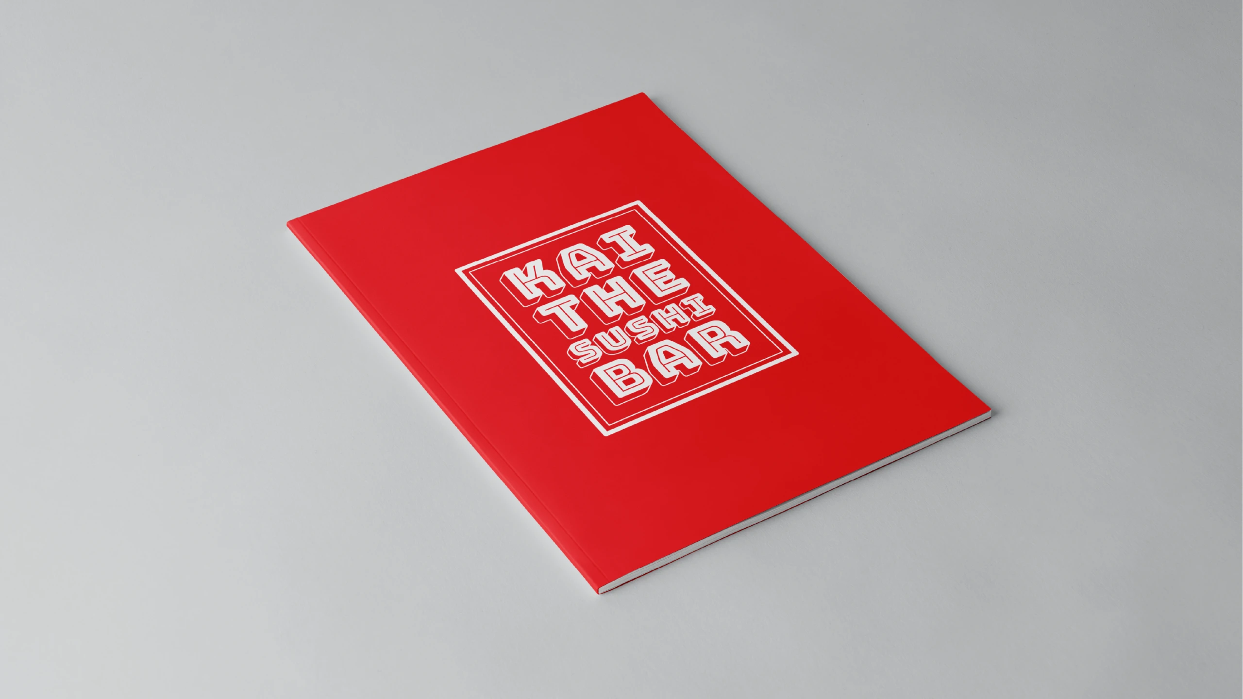
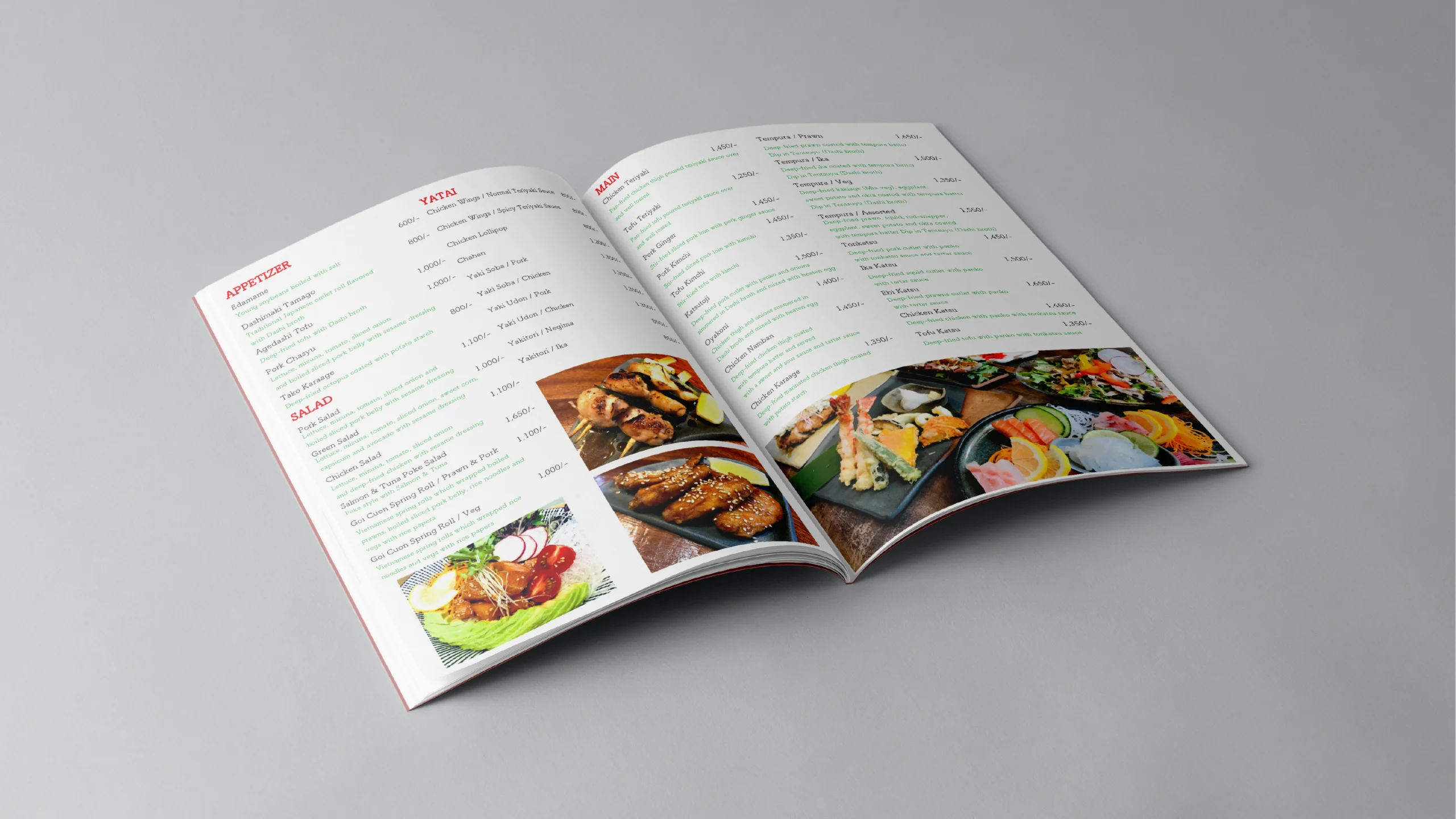
Restaurant menu redesign
Elegant, minimal brand direction
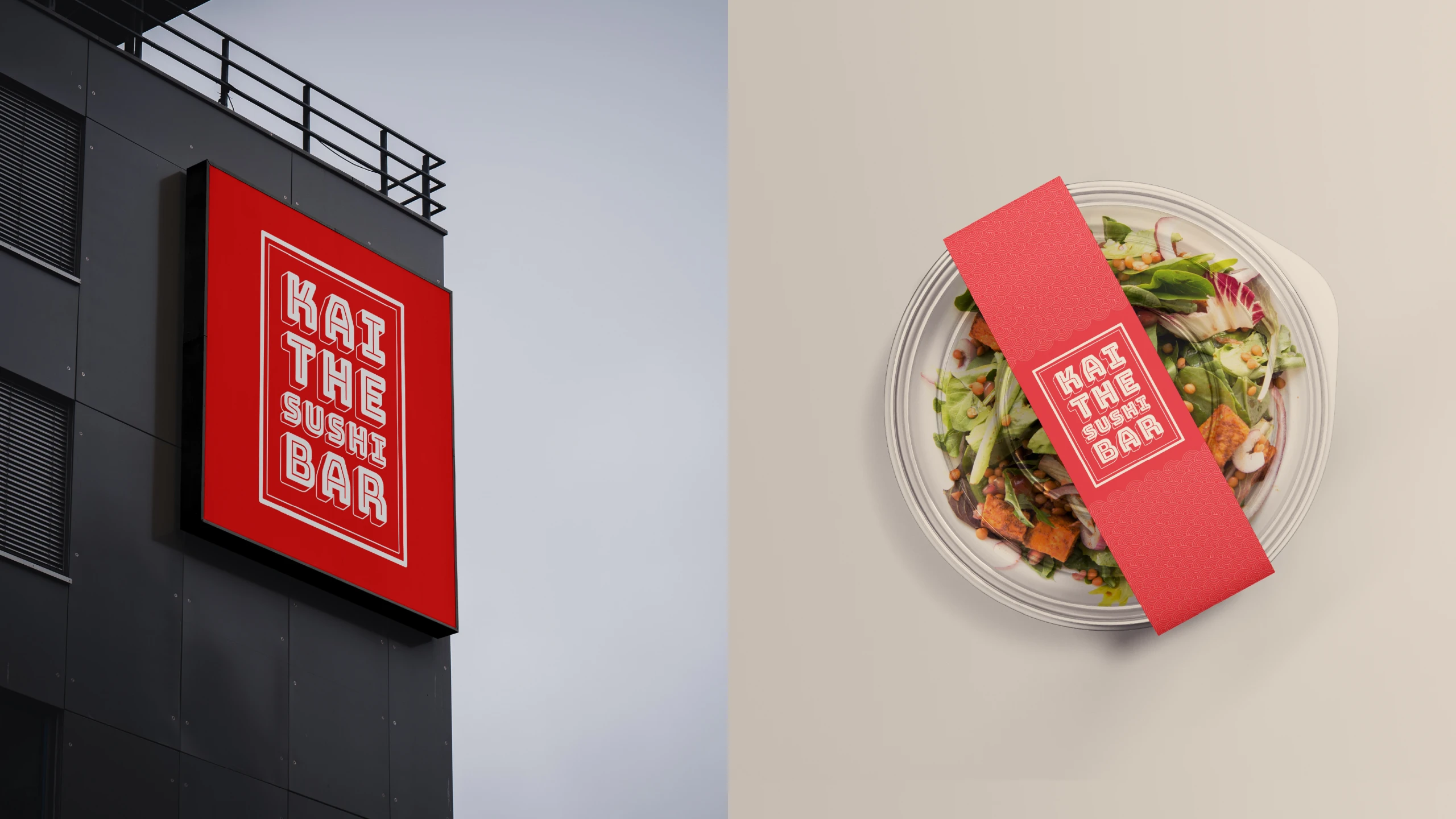
Full rebrand across customer touchpoints
KAI is a Japanese restaurant known for its elegant dining experience and cultural authenticity. Digital Metadata led a complete brand refresh to elevate and modernize the brand across every touchpoint.
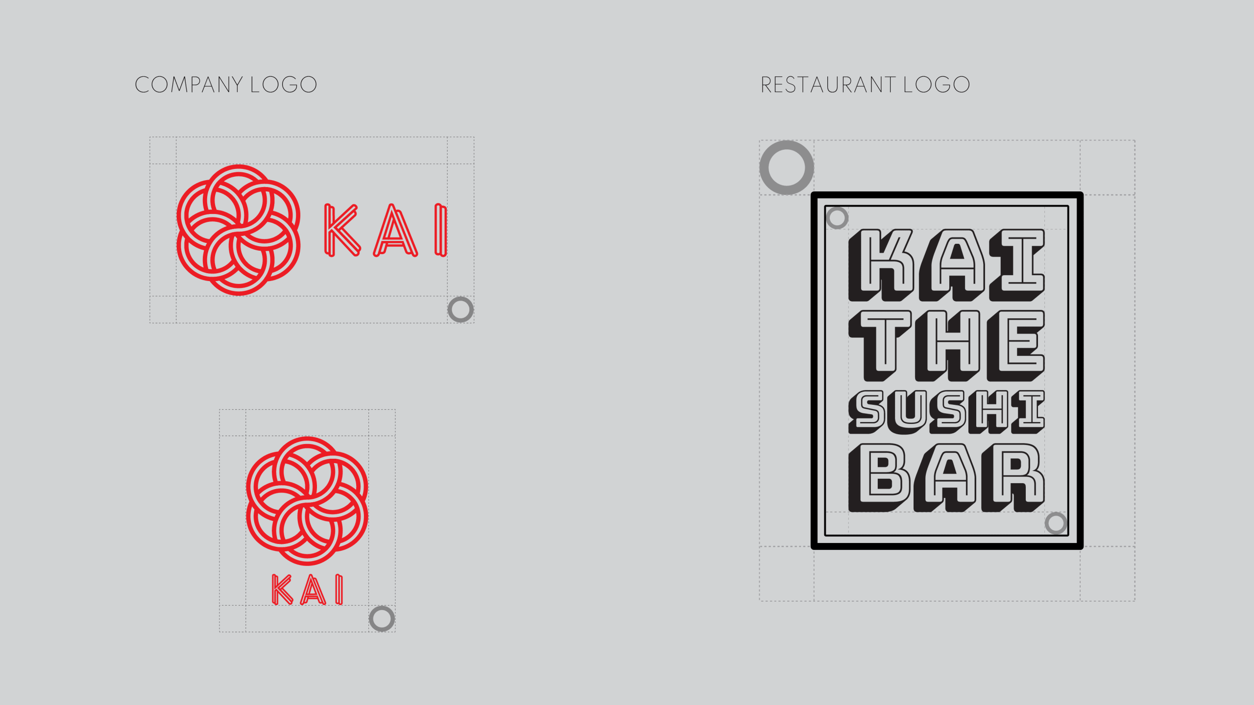
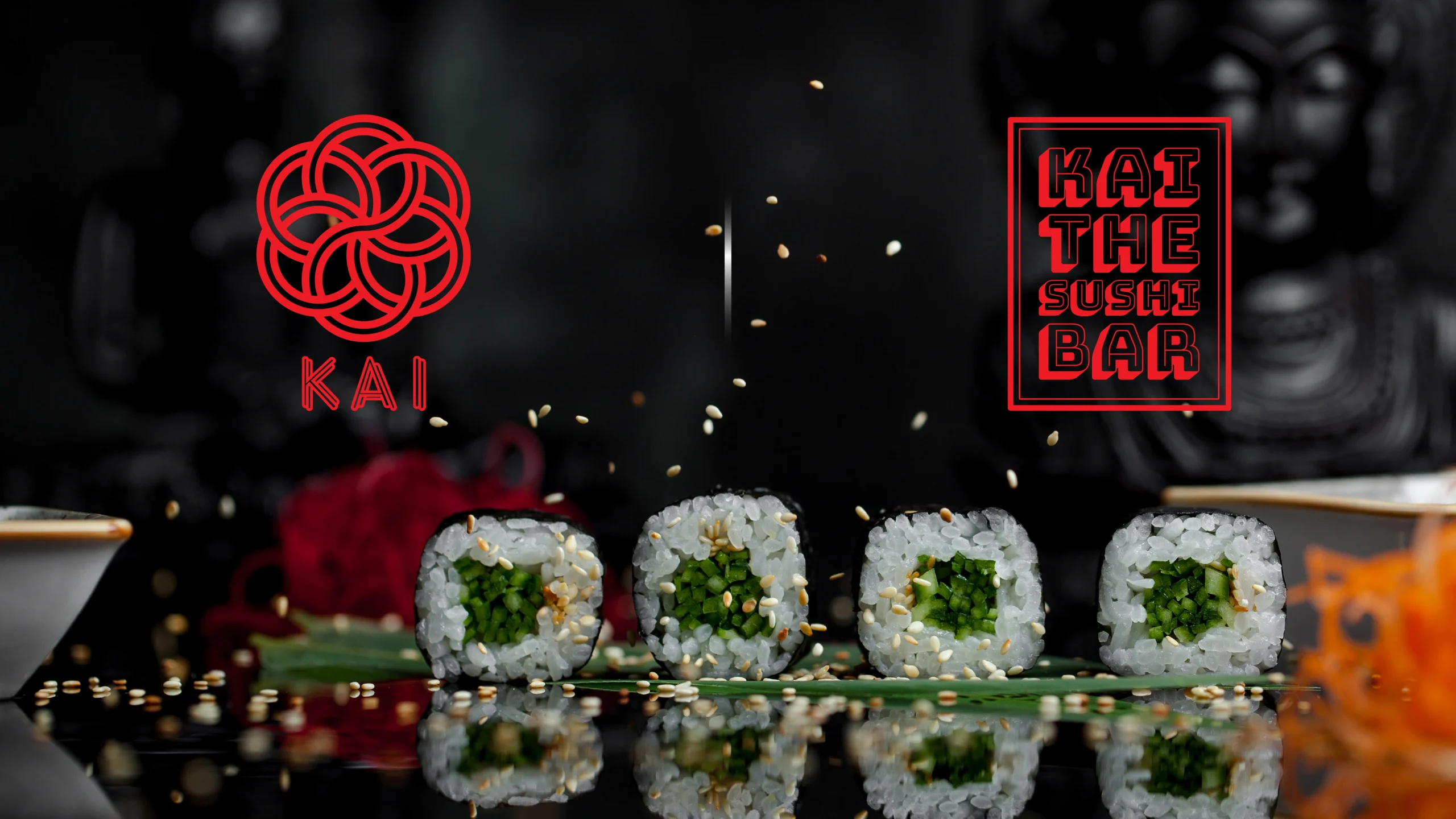
We redesigned two distinct logos—one for the restaurant and another for the parent company—to establish a refined brand system. Additionally, we revamped the restaurant menu to align with the new visual identity, ensuring consistency in tone, style, and aesthetic.
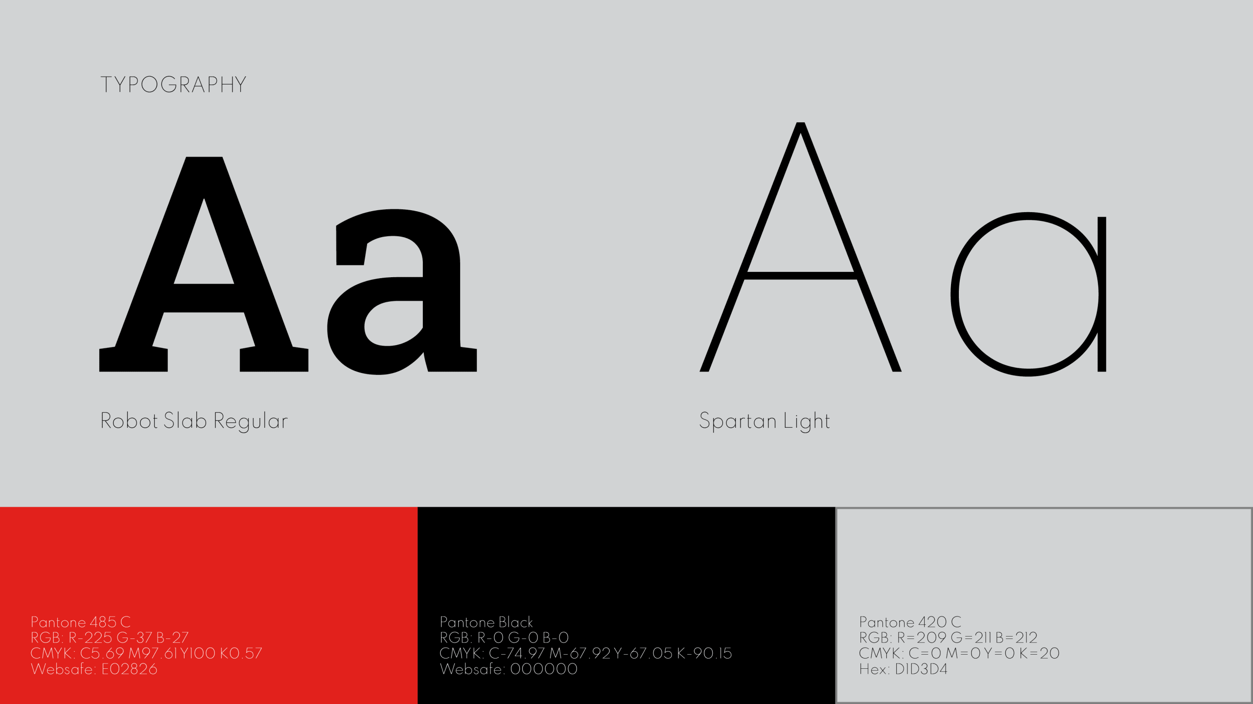
The rebrand blends minimalist Japanese design principles with modern sophistication—bringing clarity, harmony, and identity to the KAI experience.
We redesigned two distinct logos—one for the restaurant and another for the parent company—to establish a refined brand system. Additionally, we revamped the restaurant menu to align with the new visual identity, ensuring consistency in tone, style, and aesthetic.
The rebrand blends minimalist Japanese design principles with modern sophistication—bringing clarity, harmony, and identity to the KAI experience.
Cutting-Edge Creations
Brand Pulse